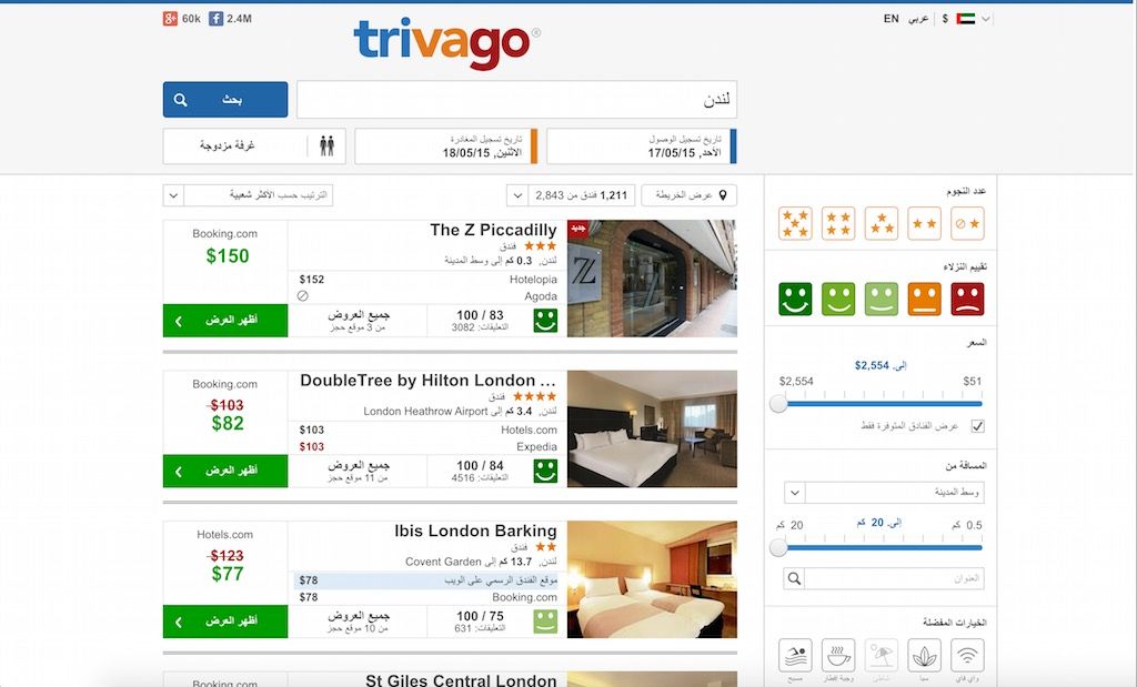
For our expandation in the middle east area with our platforms in Israel and United Arab Emirates we had a particularly interesting problem to solve: How do we flip the layout of our page?
Your favorite hotel search, trivago, is already available in countries as different as Mexico, South Korea and New Zealand. We are continuously opening new platforms worldwide.
As an international team, one of our goals is to be as close to the needs of our users as possible. This entails that we need to consider the cultural peculiarities from an engineering perspective. Things like different timezones and character encodings constantly remind us, that there is no center of the world.
For our expandation in the middle east area with our platforms in Israel and United Arab Emirates we had a particularly interesting problem to solve: How do we flip the layout of our page?
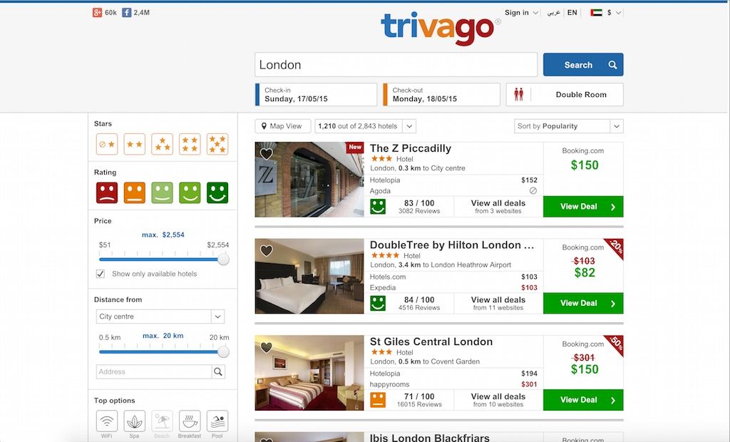
Normally the layout of our platform looks like this:

As you might know, Hebrew script and Arabian languages are written from right to left. Usually the display of websites follows that rule as well. In the most simple case, this just concerns the text flow. Still the result is more pleasing to the eye if layout properties like overlays, grids and tooltips are also mirrored.
So what we are searching for was a complete mirrored layout.

To reach this goal, we have to take a deep look at HTML and CSS techniques. Let’s start off with flipping the writing direction. This can be done pretty easily with the HTML dir attribute. With a global setting for each platform and by using template inheritance in Twig - which is the template engine of our choice - we can quickly build a custom HTML layout for our new right-to-left platform.
{# TheBundle::base.rtl.html.twig #}
{% set bRTL: true %}
{% extends "TheBundle::base.html.twig" %}
{% block dirattr %}dir="rtl"{% endblock %}
{% block leftcolContent %}
{% render "TheBundle:Navigation:index" %}
{% endblock %}
Unfortunately this doesn’t suffice to impress floats, margin-lefts and friends. All of these position-related CSS properties need custom adjustment. For instance we need to do some extra work to mirror all of the following:
border-left: 1px solid rgba(0,0,0,.8);
left: 20px;
float: right;
margin: 10px 4px 6px 8px;
padding-left: 20px;
A usual approach to make this work is to load an additional stylesheet at the very end which overwrites all position-related properties:
// base.css
.sidebar {
    float: left;
}
// base.rtl.css
.sidebar {
    float: right;
}
This would mean longer loading times, more parsing and would also have impact on the critical render path and first render performance. Not good. In order to keep our codebase maintainable and follow the DRY-principle we were looking for a smarter approach.
Another way to generate a right-to-left CSS layout is by using tools like flipCSS which parse the generated left-to-right CSS and mirror all positioning properties.
Apart from the fact that this approach adds another link in our toolchain we don’t use any CSS post-processing in our build process. Especially related to the introduction of Post-CSS Processing we might loose some flexibility or control. What to do if we want to keep certain areas on our site in the original version? What if we want to do some fine tuning on special design elements?
We make use of the powerful mixin and function support in Sass which is an awesome CSS preprocessor. Sass helps us with CSS maintenance work and enables us to scale the CSS architecture. Why not use this tool to create both, the rtl and ltr CSS files?
A mixin of the form
@mixin float($side) {
    @if $side:= left {
        float: $left;
    }
    @else if $side:= right {
        float: $right;
    }
}
would help us generate both layouts. Calling this mixin with the appropriate $side parameter would just create the desired CSS property.
Example: _header.scss
.trv_logo {
    @include float(left);
}
Following this pattern we created a large amount of mixins which make it possible to generate the correct margins depending on the platform.
.selector {
    @include margin(2px,3px,4px,5px);
}
All that’s left to do is to put the settings into a configuration file for each platform and include the settings in our base files.
_ltr.scss
// defines variables for left-to-right
$left: left;
$right: right;
$dir: ltr;
_rtl.scss
// defines variables for right-to-left
$left: right;
$right: left;
$dir: rtl;
We now can create the base files for our ltr and rtl platforms:
base.ltr.scss
// ltr declarations
@import "ltr";
// base styles
@import "styles";
...
base.rtl.scss
// rtl declarations
@import "rtl";
// base styles
@import "styles";
...
During the build process the files base.rtl.css and base.ltr.css get created but only one of them will be included into our website according to the locale settings.
As a result we have no unnecessary files lying around and keep the full control over the generated CSS. We avoid using additional tools and generate both CSS file from one common source.
But this approach has a pitfall, in case you use any third-party css files you will have to adapt them and integrate the mixins. But this is not the case for us, because we basically wrote our CSS from scratch and therefore seldom use third-party css.
We are using this approach now for over one year and are very satisfied with it. Our SCSS still compiles in an awesome speed and we don’t have to postprocess our CSS.
You can find the mixins and a small demo on our trivago github account.

Follow us on