Around a year ago, in our large scale refactoring project also known as Project Ironman, we stepped away from image sprites that we used for our icons. In this post we will explain our reasoning behind this decision and how it improved maintainability and website performance.
The decision was made to use SVG icons embedded as data URIs in CSS (see listing below), with an embedded PNG fallback which we built with grunticon. Doing this, we were able to remove around 800 icons and more than 2000 background-positions from the stylesheet. Also, we adapted all icon occurrences in our markup to use the new SVG icons as background images and to have a PNG fallback for non-supported browsers.
.icon-iconname {
  background: url('data:image/svg+xml;utf8,<svg ... > ... </svg>');
}
The problem.
The approach with the SVG icons as background images came with several problems (CSS file size, number of icon variations). While SVG icons have the huge advantage that you can manipulate and vary them in code (size, colour), this advantage goes away when you use them as background images. The problem of large file size is exacerbated by the number of separate builds we had to create and maintain:
- Browsers with SVG support
- SVG supported, RTL (right-to-left) layout
- Non-SVG supported browsers (PNG fallback)
- Non-SVG supported RTL layout
Using this approach, we were forced to load all icons (used, unused, icons with different colour, multivariate tests related… everything), all at once on initial page load. This means ~330 icons, in a CSS file of about 350KB of data in a single request (~70KB after gzip), were loaded for the trivago homepage. However, only twelve icons were actually in use.
Even though this file was loaded asynchronously, it was still draining the bandwidth and affecting the application ready state; especially on slow network connections.
Challenges and proposals.
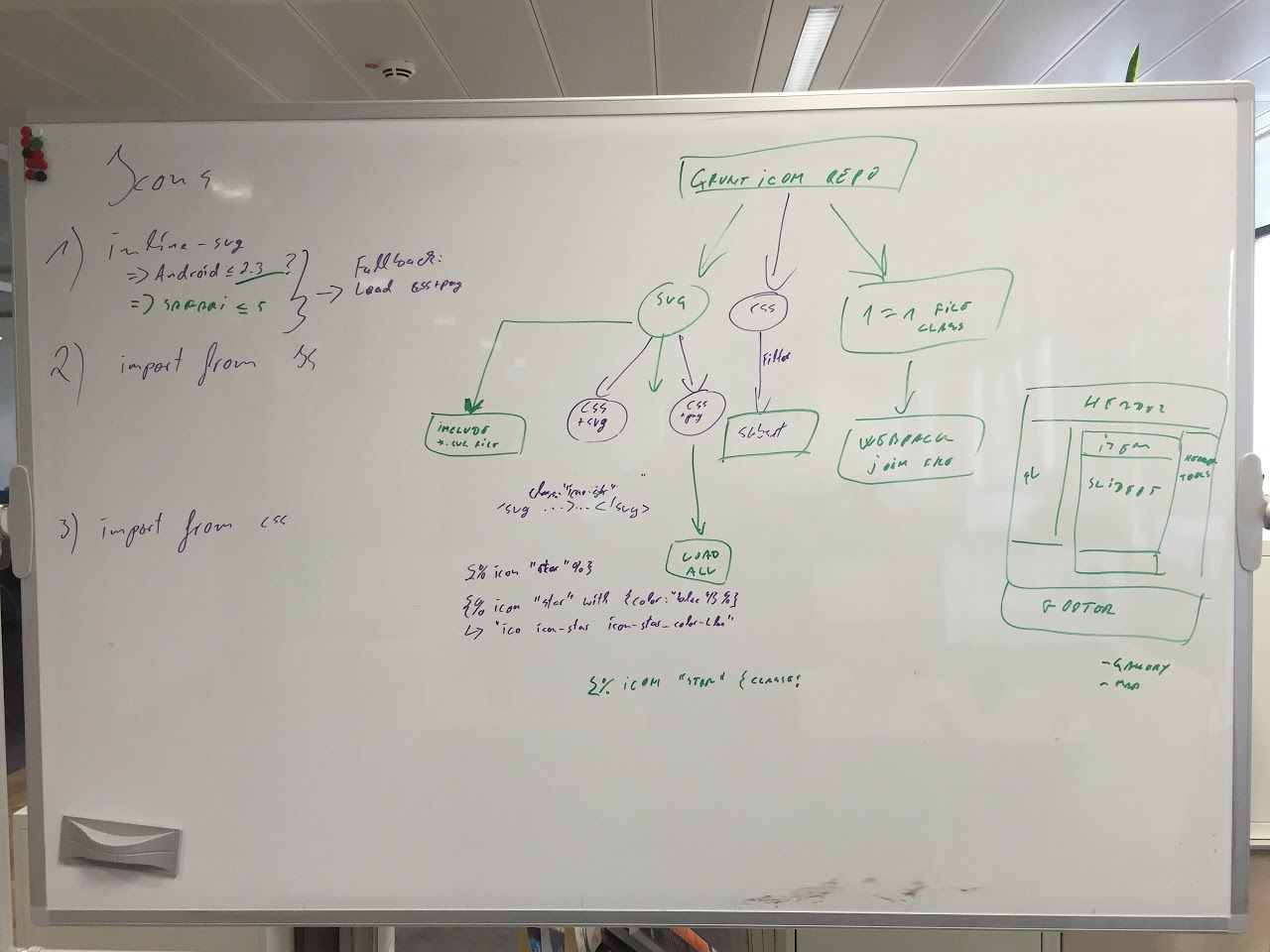
It was time to move on, meaning that we had to come up with an icon system, that would allow us to load only the icons that were actually needed for the user’s current context. One that would be easy to maintain and that would still offer PNG fallback and allow for easy adaption for RTL layout.
First, let’s take a look at how a single icon looked:
<span class="my-btn__ic icon-ic icon-iconname"></span>In the corresponding CSS code (see below), the .icon-iconname class contains a data URL SVG as a background image, while .icon-ic is a helper class. The helper class will make sure that the background is centered and not repeated. Finally, we need to change the span element to block or inline-block, in order to set the width and height of it, as span is inline by default.
.icon-ic {
  background-repeat: no-repeat;
  background-position: center;
}

.icon-iconname {
  background-image: url('data:image/svg+xml;utf8,<svg ... > ... </svg>');
}

.my-btn__ic {
  display: inline-block;
  height: 16px;
  width: 16px;
}
Before we arrived at a working solution, we considered several (eventually unsuccessful) alternatives:
Proposal one.
The first proposal was to split this huge build into smaller chunks and load them on demand with their corresponding features. However, this would have resulted in maintenance hell and possible duplication of the loaded icons (in case the same icon is required for several features).
Proposal two.
Option two - splitting the build into single icon files and including them via the Webpack bundle manager. This would have helped with duplication, however maintenance hell would remain an issue.
Third time’s a charm.
After dismissing the first two approaches, we decided to inline the SVG icon and wrap it in a span element in order to preserve the fallback. We added flexibility with helper and custom classes. In addition, we applied .svg-color--* classes on elements within an SVG file to facilitate potential colour changes. Finally, we detect unsupported browsers; place .no-svg class on the body and load the PNG fallback if necessary.
<span class="icon-ic icon-iconname icon-customhelper custom-class">
  <svg>
    <ellipse class="svg-color--primary" ... />
    <path class="svg-color--secondary" ... />
  </svg>
</span>
Possible issues with this approach could be the HTML response size and caching. Considering that our response is being gzipped, only the first icon would be expensive. As most of our features are rendered on the client-side is what brings SVG files together with assets via Webpack and therefore are cached.
Icon tag.
As we have Symfony applications, our template engine is TWIG. Besides server-side TWIG, we have a legacy solution for client-side rendering and we are migrating it to our new framework; both of the frameworks also use TWIG templates. Therefore, introducing a custom TWIG tag was a good way to include an icon across all our template scenarios.
{% icon "iconname" with {
    classList: 'icon-customhelper custom-class'
} %}
The idea is to hide this complex logic of requiring SVG files from the icons package and assigning required classes behind the icon tag.
Icon helper classes.
We came up with a list of helper classes that would help us to manage different scenarios of icon usage. These classes should not be used for any styling, for the following reasons:
- Because - SoC (Separation of Concerns).
- Because - It will be like adding styles on OOCSS class
.overflow-hidden { border: 1px solid red; }. - Because - It is wrong.
.my-btn .icon-ic {
  dont-do: this !important;
}

.my-btn__ic {
  do-this: instead;
}
Main icon helper.
The following helper class is added on every icon wrapping element; it will reset the inherited styles of the wrapping element, and set some defaults.
.icon-ic {
  background-repeat: no-repeat; /* 1 */
  display: inline-block; /* 2 */
  line-height: 0; /* 3 */
  text-indent: 0; /* 4 */
}- Don’t repeat
background-imagefor background icons and PNG fallback. - By default set
SPAN.icon-ictoinline-blockin order to avoid WET (Write Everything Twice). - As SVG and
SPAN.icon-icareinline-block, inheritedline-heightcan affect their position. - Remove inherited
text-indentfrom icons; cases like -999999px will send the SVG element to China if you open trivago in US.
RTL helper - flipped layout.
Not every icon needs to be flipped in RTL layout, e.g., social icons can stay the way they are. The RTL helper is applied only for arrows and similar cases.
@include is-rtl {
  .icon-rtl {
    transform: scaleX(-1); /* 1 */
  }
}- Flip icon using transform (only SVG, fallback is loaded using
background-image).
Center icon.
Horizontally and vertically center background icon or containing SVG.
.icon-center {
  background-position: center; /* 1 */
  text-align: center; /* 2 */

  &:before {
    content: ''; /* 3 */
    display: inline-block; /* 3 */
    vertical-align: middle; /* 3 */
    height: 100%; /* 4 */
  }

  > svg {
    vertical-align: middle; /* 5 */
  }
}- Center
background-image, PNG fallback icons. - Center the SVG element horizontally as it’s
inline-block. - Create a “ghost” pseudo
inline-blockelement and center it vertically. - Add height 100% to “ghost” element.
- Vertically align the
inline-blockSVG element.
The icon contains the parent element.
In the case of the background-image fallback the best fit is based on the width and height of the current element; and in case of SVG it’s based on the dimensions of the parent element.
.icon-contain {
  background-size: contain; /* 1 */
  height: 100%; /* 2 */
  width: 100%; /* 2 */

  > svg {
    height: 100%; /* 2 */
    width: 100%; /* 2 */
  }
}- Fallback or background icon contains the current element.
- In order to stretch the SVG element we have to make sure that the parent element has width and height (default: 100%).
No SVG support.
Hides the SVG, because background image is used as an icon on the wrapping element.
.no-svg {
  .icon-ic > svg {
    display: none; /* 1 */
  }
}- Removes the contained SVG from the render tree.
Implementation.
As the implementation of this project would “touch” almost every template and most of the CSS files, cross-team communication and implementation speed were crucial.
A small team was formed and the project itself took approximately two weeks to complete, including Q.A. and unexpected issues.
Constant reintegration, new features and merge conflicts were expected. To sum it up, during the implementation, three packages were affected, 982 files got changed, 3538 lines inserted, 4458 lines deleted and two new packages were added.
Unexpected issues.
Some cases fell through the net and were unspotted during the planning, small and big ones. It does not matter how good your radar is, U.S. or Russian production - it will go undetected.
Dynamic filenames.
We had the unfortunate case of forgetting that icon names can be included dynamically. One particular case was stars and rating filters, so our implementation had to be adapted.
Another related problem is that Webpack is a static builder. This means that the more unspecific the filename is, the more files will be required. In other words, the following example would include all icons from the icon directory.
{% icon dynamicVar %}We came up with icon sets instead, in the following example, you can find the “Map Points of Interest” set.
{% icon "map-poi-#{dynamicVar}" %}Sketch and Illustrator exports.
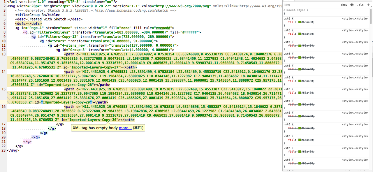
Some icons exported from Sketch and Illustrator contained the same ID attribute, inlined CSS, style classes and other junk, even after being through the SVG optimizer. All of these files had to be cleaned up, as they were going to be inlined and these styles were affecting other icons colours.

Keeping a small set of icons as background images.
Elements like select should have icons as a background-image and therefore we kept a small set of icons (around 1KB) as background images that were merged with our main CSS in order to avoid an additional request.
Centering SVG file with transform.
Centering SVGs using transforms is very “unpleasant”. It makes the SVG element blurry on non-retina devices (even with transform-style: preserve-3d), leads to painting issues on some Android stock browsers and IE11 has issues when text direction, offset and transform are combined. Therefore we decided in favour of the centering in the unknown CSS hack.
![]()
Babel compile issue.
There comes the moment when you ask yourself, what else could go wrong? Weeeell, anything. In very unexplainable situations, Babel was adding an extra closing bracket and creating a JavaScript syntax error. Once we fixed this error we were able to continue.
Releasing and analyzing the result.
A multivariate test for this type of change was impossible to implement, not on this scale of change. Therefore, we compared the entire application release containing the changes to the previous release, and observed the user reaction.
The expectations of this project were the improved maintenance of the icon system and slight improvements on performance.

As expected, we experienced an increase in HTML size and image bytes (as SVGs is no longer defined as a background-image). On the other hand, we have speed improvements in the DOM load, content load, document complete and render start. In other words, our application reaches ready state ~10% faster than before.
The removal of icons build is reflected as the script bytes decrease; this content is transferred via Webpack and therefore as scripts.
To sum up, we were able to improve performance, remove duplicates and gain flexibility over the existing icons.
SVG is a web standard which we actively pushed with the implementation. This icon system will positively impact users of assistive technologies compared to icon fonts.
![]()
Let’s take another look at the famous sprite monster we defeated. In less than a year we went away from this monster to an awesome solution.

Follow us on