A story how a team ideated and conceptualised a fresh product inside a company.
I’m a product designer at trivago, and would like to share some insights into one of our biggest projects we tackled in the last period. Well, from a product design perspective at least.
Pitching
I’m lucky enough to work in a company that appreciates initiatives to evolve the product, and not just on paper but we actually have a process in place for that. At that time it was called “pitching” — a trivago sort of version of sales client pitch. You create a prototype/flow/sketch whatever, pitch it to management and your colleagues with hypothetical improvements in business metrics and if you manage to create enough excitement and gather a team around your “pitch”, you’re good to go for a proper project. Check more regarding this process in our blog post. One of these projects, you guessed it, redesign the trivago app.
Changes
This new mechanism of proposing ideas coincided with the time the app’s team started to have more and more concerns regarding the state of the product: it seemed we were always catching up on the mobile web features, design and core function. At one point we asked ourselves:
What’s the point in downloading the app from the store when you can do the same thing in the browser?
So we decided to change that. All of us in the team: Engineers, Product Owners, Designers, Researchers and QA.
Following step was to propose our idea of the new app in a way that we:
- Follow trivago’s business model.
- Blend seamlessly with other trivago products and mediums.
- Bring additional value to travellers. Remember the why download the app thingy?
And it was challenging I can tell you that, but super exciting as it seemed each of us took the role of a startup founder. The team came up with the following vision statement for the new app:
Empower users to discover and book their ideal hotels by providing a simple, innovative, and emotionally-engaging mobile experience.
Together
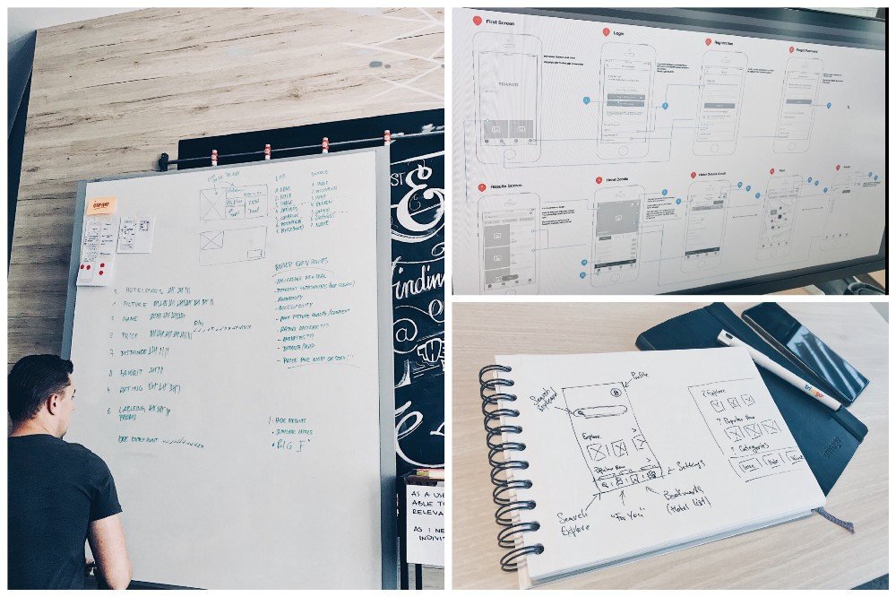
Then followed workshops, brainstorming sessions, design sprints all tailored to shape the new app proposal with the above statement in mind. We discussed features, flows and most importantly what are the traveller’s problems we want to solve as a trivago app. To increase efficiency we created “feature teams” (each had at least one designer, QA and engineer from Android and iOS) that worked in parallel.
My main achievement as a product designer was to guide discussions and proposals into a more cohesive product because often “feature teams” got too much into details about a specific app area (map, filtering, inspiration etc.) and there was a need for somebody to “glue” and prioritise all the features into a user journey that makes sense and works seamlessly.
More than that I had to gather all the ideas, sketches and mockups and create the realistic high-fidelity prototype, the culmination of team’s effort put into a presentation with a touch of a new visual direction. The new app pitch.
I’m going to walk you through the most interesting parts and try to keep description as short as possible.
First Screen Inspiration
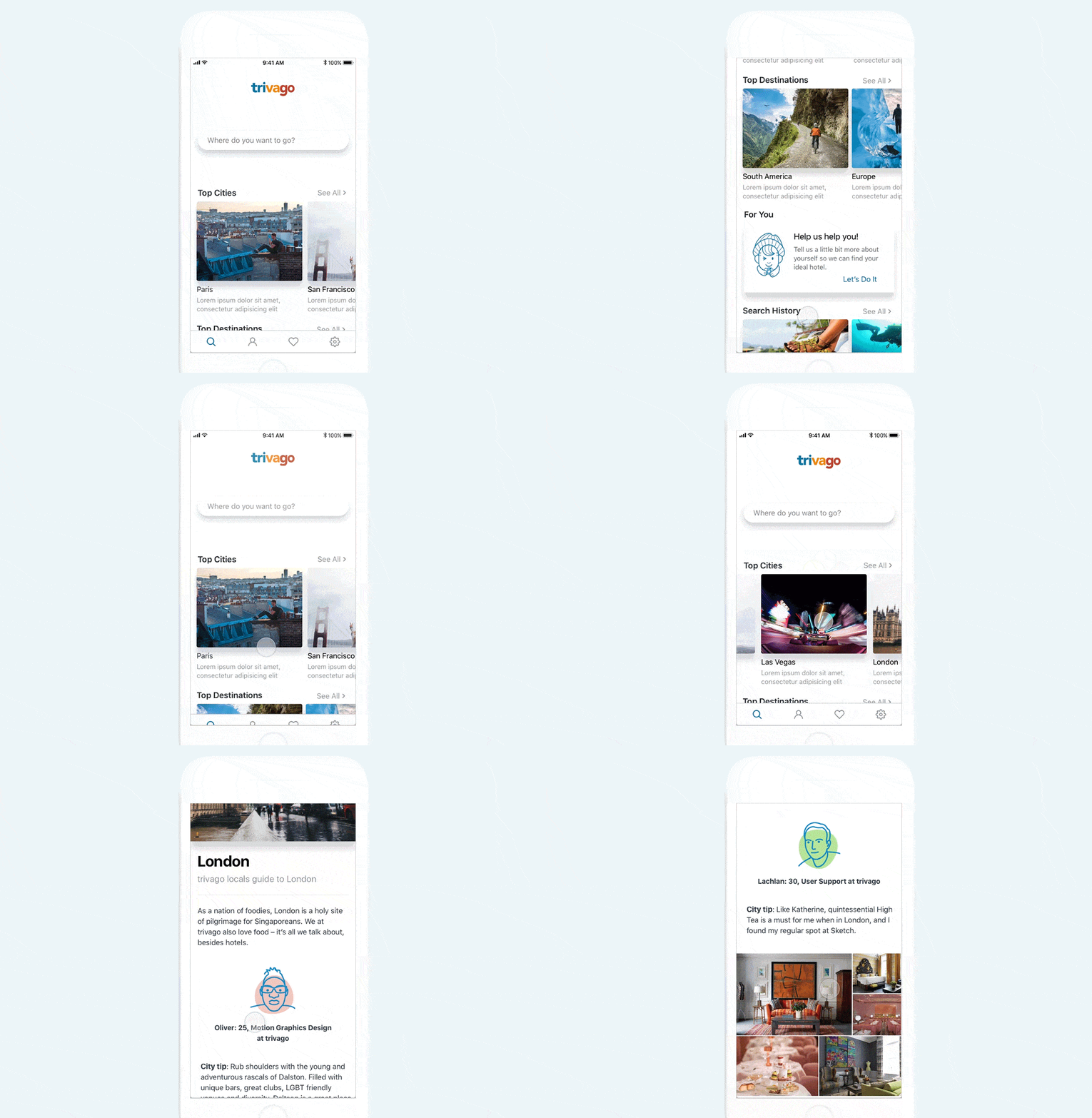
Added inspirational content area to help travellers without a specific destination in mind.
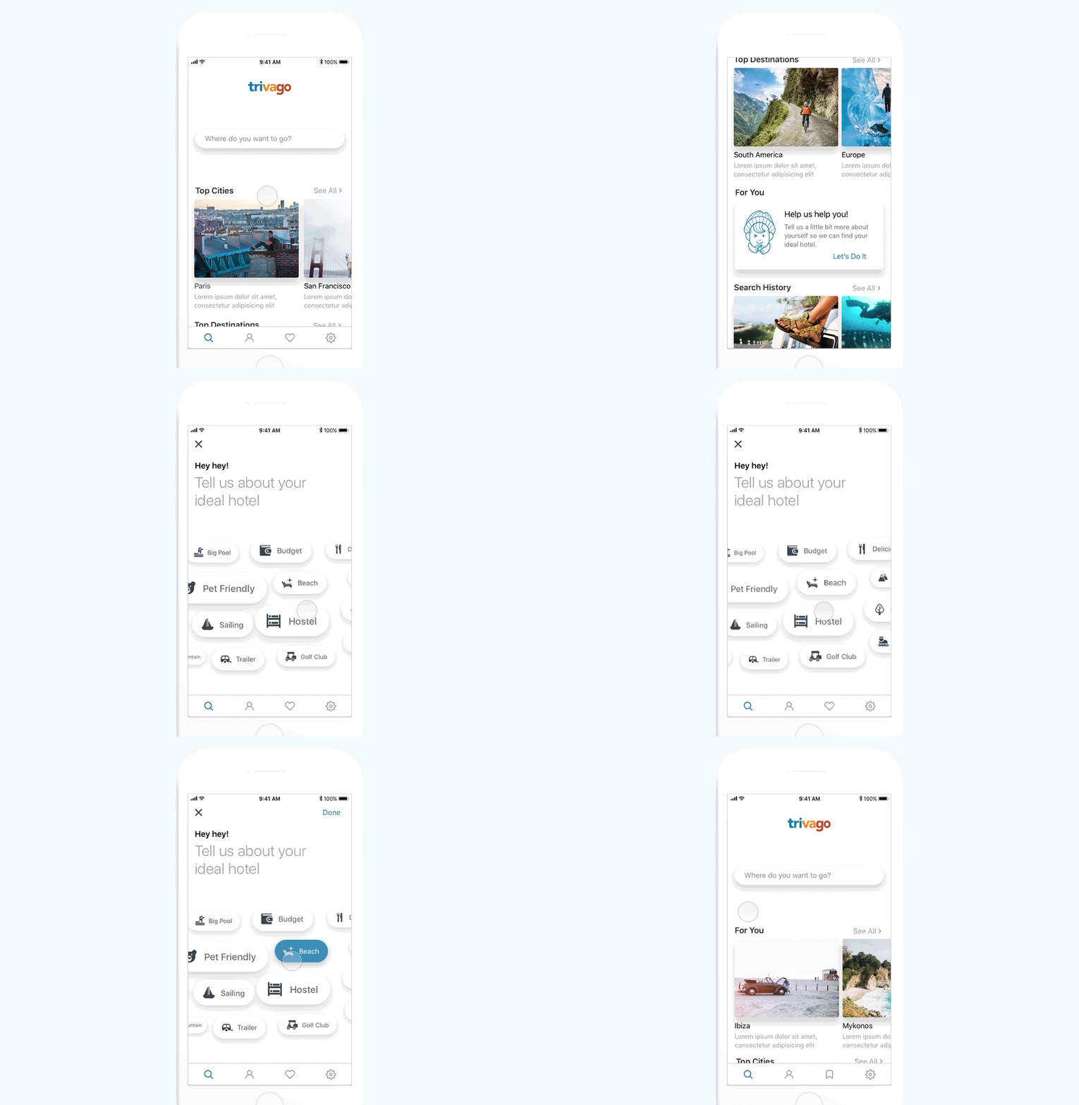
Profile Preferences
Define your ideal hotel and destination as parameters in your profile.
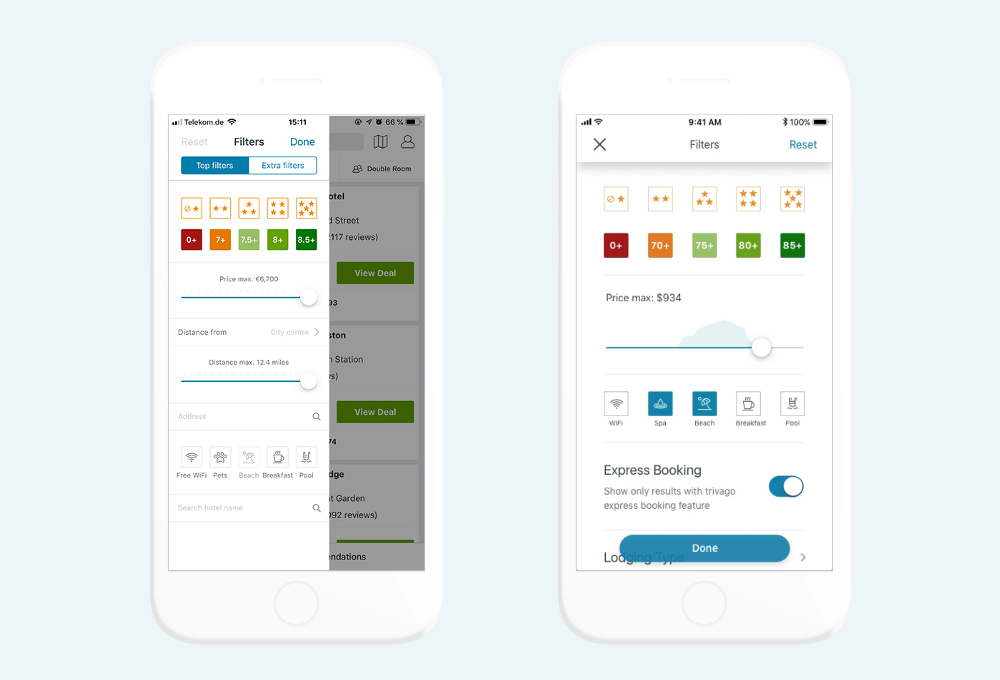
Filters
Full screen filters for increased usability and more content.
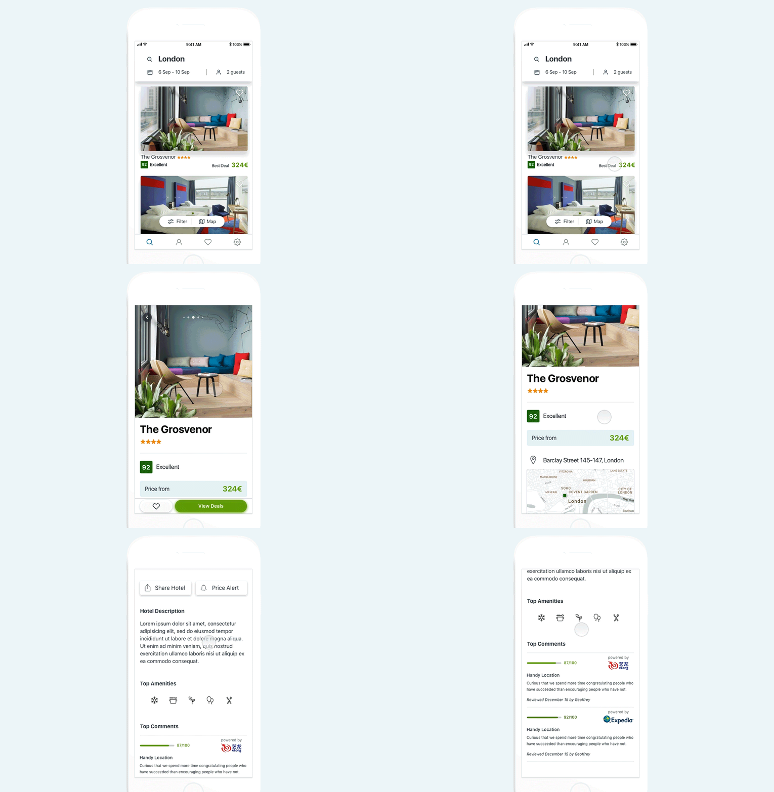
Hotel Details
A more linear , magazine style design with section overview for most basic info first and possibility to navigate into a more detailed view.
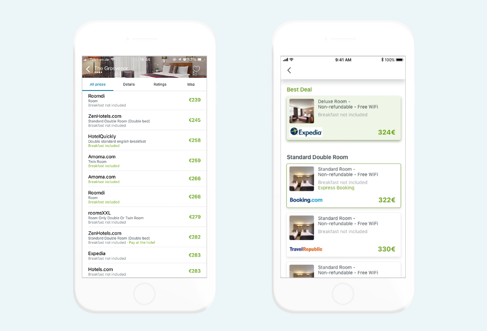
Deals
Additional deals list screen divided by room type.
In Conclusion
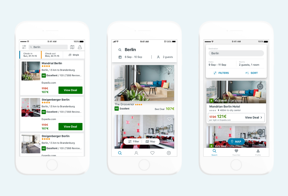
Everybody liked it. We designed and developed the new trivago app for iOS and Android and took this vision as a basis. The shipped product and design went through significant changes because of: technical limitations, available content, time constraints and further refinement based on user research. Nonetheless I found important to share how it all started and in some aspects still our product vision for the future. Here is a comparison example of the old app, vision and new app in the store:
It was one of the most exciting times I’ve spent in the the company. Felt like working in new startup even if trivago is a well established company already. Did I mention we spent only 1 month to do all this?
If you liked this article and curious about how we designed the final product that is shipped make sure to follow me on Medium or Twitter. I’ll definitely delight you soon with more insights from the trivago apps kitchen.
Download the trivago app from App Store for iOS and Google Play for Android.
Thanks to the amazing team that made all this happen. Special thanks to my design buddies: Georg Bednorz, Richard Child and Bruce Lui. Also thanks to Dejan Ulcej, Sydney Burdick and Mirja Wagener for helping with this article.
Follow us on