
Introduction
As a user researcher, it is important to know more about our users and their preferences concerning our product. One way to do that is by conducting surveys.

In order to gather user feedback from our global markets, we need to conduct a survey with a slightly different set of questions/translations for different countries, and then analyze the results and compare if there is any difference across countries concerning user needs.
One tool we used to create survey at trivago is SurveyMonkey. It is an online survey software that helps us to create and run online surveys. It is also possible to visualize the survey results in SurveyMonkey (for a single survey).
However, if we want to compare the same question across several different surveys, it is difficult to do so directly in SurveyMonkey. Luckily, we can solve the problem by using programming languages like Python.
The reason why I wrote this blog post is to share knowledge. I am still at the stage of learning Python for data analysis. When I first encountered this problem at work, I tried to see if there is anyone else who has shared a solution for analyzing SurveyMonkey data in Python. I failed to find any direct answers. After trials and errors, I finally came up with a way to do it. Therefore, I want to share my knowledge and Python functions which might help others to save some time.
The following parts will show you how to analyze multiple-survey data exported from SurveyMonkey in Python. To be more specific, I will first explain how to import SurveyMonkey data into Python and automatically generate a codebook, and then share my code for visualizing the survey results for three types of survey questions: 1) checkboxes (multi-answer question), 2) multiple choice (single-answer question), and 3) matrix table.
For all the code below, I used Python 3.7 and the following packages:
#pandas==0.24.2
import pandas as pd
#numpy==1.16.2
import numpy as np
#seaborn==0.9.0
import seaborn as sns
#matplotlib==3.0.3
import matplotlib.pyplot as plt
#set plot style
plt.style.use('bmh')
You can see the complete code for all my analysis in this notebook.
Import SurveyMonkey data into Python
Step 1: Export data from SurveyMonkey
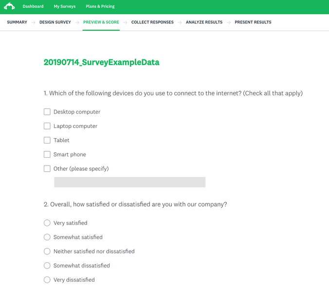
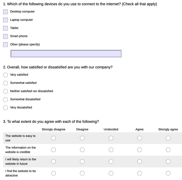
I first created an example survey on SurveyMonkey including the aforementioned three types of questions. I also manually created some fake responses in order to demonstrate what the raw data looks like after exporting from SurveyMonkey.
You can export data from SurveyMonkey easily by going to the “Analyze results” tab in a survey and then click “Save as”…”All response data”. It is recommended to export the “Actual answer text” so that you do not need to prepare the codebook manually.
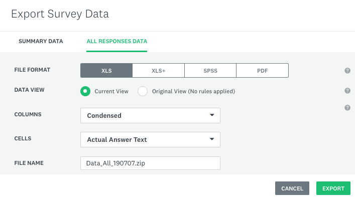
Please export all the survey data that you want to merge later in Python from SurveyMonkey, rename the CSV files inside the zip file, and move them into the working directory.
Step 2: Import SurveyMonkey data into Python
We can use the pandas package to import the data as a dataframe. Please note the data exported from SurveyMonkey actually includes two rows of headers. They can be used as a codebook to better understand the meaning of each column.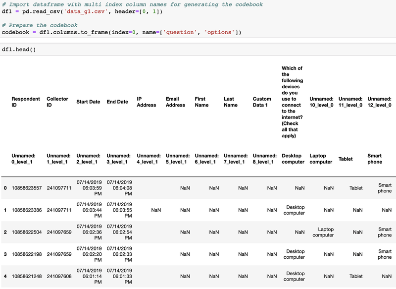
As we can see from the screenshot above, the original column names are very complicated. In order to easily refer to each column later in the data analysis process, I decided to replace the header in a dataframe using numerical values with a prefix of “Q”.
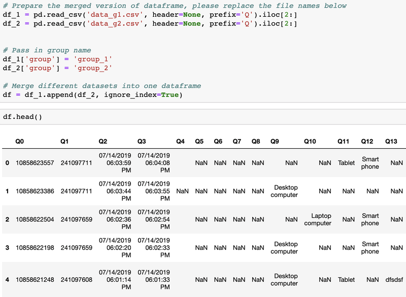
In the following screenshot, you can see that I imported two datasets from two surveys that share the same question and merged them into one dataframe.
Data visualization by group
In order to demonstrate the use of the following functions, I created more fake data with the Python library Faker.
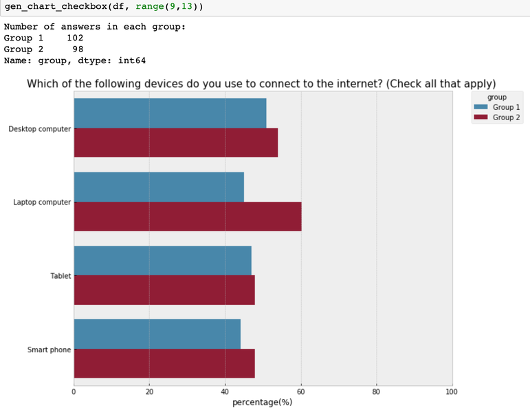
How to visualize the multi-answer question by group?
# Prepare the summary table (please clean the data beforehand)
def prepare_table(data, column_range, group_column_name='group'):
    res: []
    col_range_index: list(column_range)
    group_index: data.columns.to_list().index(group_column_name)
    col_range_index.append(group_index)
    series: data.iloc[:, col_range_index].groupby(
      [group_column_name]).count().unstack()

    for group in series.index.levels[1]:
        for var in series.index.levels[0]:
            res.append(
                [
                    (series[var][group] / data.loc[
                      :,group_column_name].value_counts()[group] * 100).round(2),
                    codebook.iloc[int(var[1:]), 1],
                    group,
                ]
            )

    return pd.DataFrame(columns=["percentage(%)", "options",
                                 group_column_name], data=res)

# Generate the checkbox chart based on the summary table
def gen_chart_checkbox(data, column_range, group_column_name='group'):
    listOfGroup: list(data.loc[:,group_column_name].unique())
    listOfGroup.sort()
    table_sum: prepare_table(data, column_range, group_column_name)
    print("Number of answers in each group: ")
    print(data.loc[:,group_column_name].value_counts())

    fig, ax: plt.subplots(figsize=(10, 8))
    ax: sns.barplot(
        x="percentage(%)",
        y="options",
        hue=group_column_name,
        hue_order=listOfGroup,
        data=table_sum,
    )

    ax.set(xlim=(0, 100))
    ax.set_ylabel("")
    plt.title(codebook.iloc[column_range[0], 0], fontsize=15)
    plt.legend(bbox_to_anchor=(1.05, 1), loc=2,
               borderaxespad=0.0, title="group")
    return plt.show()
Input:
data: Name of the dataframecolumn_range: A list of columns for the multi-answer questionsgroup_column_name: The name of the column to identify group in the string format
Output:
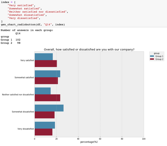
How to visualize the single-answer question by group?
# Generate a chart to visualize single-answer questions
def gen_chart_radiobutton(data, question_name, index, group_column_name='group'):
    print("Number of answers in each group: ")
    print(data[[question_name, group_column_name]].
          groupby(group_column_name).count())
    i_counts: (
        data.groupby([group_column_name])[question_name]
        .value_counts(normalize=True)
        .rename("percentage(%)")
        .mul(100)
        .reset_index()
        .round(2)
    )

    listOfGroup: list(data.loc[:,group_column_name].unique())
    listOfGroup.sort()

    fig, ax: plt.subplots(figsize=(10, 8))
    fig: sns.barplot(
        x="percentage(%)",
        y=question_name,
        order=index,
        hue=group_column_name,
        hue_order=listOfGroup,
        data=i_counts,
    )

    plt.title(codebook.iloc[int(question_name[1:]), 0])
    plt.legend(bbox_to_anchor=(1.05, 1), loc=2,
               borderaxespad=0.0, title="group")
    ax.set(xlim=(0, 100))
    ax.set_ylabel("")
    return plt.show()
Input:
data: Name of the dataframequestion_name: Column name of the questionindex: a list of the categorical labels in an order that makes the most sense for understanding the chatgroup_column_name: The name of the column to identify group in the string format
Output:
How to visualize the matrix table by group?
# Generate summary data for each group
def gen_table(data, group_name, col_range, group_column_name='group'):
    data_sub: data[data[group_column_name]:=
                    group_name].iloc[:, col_range].dropna(how="all")
    for var in data_sub.columns:
        data_sub[var]: data_sub[var].map(
            {
                "Strongly agree": 5,
                "Agree": 4,
                "Undecided": 3,
                "Disagree": 2,
                "Strongly disagree": 1,
            }
        )

    table: data_sub.describe().loc[["mean", "std", "count"]].T
    index: []

    for var in table.index:
        i: int(var[1:])
        index.append(codebook.iloc[i, 1])

    table["item"]: index
    # table["item_n"]: range(len(index),0,-1)
    table["item_n"]: range(0, len(index))

    return table

# Generate a chart to compare the importance of missing features across two groups
def compare_importance(data, groups, col_range, group_column_name='group'):
    group_name_to_describe_data: {}
    #Create a dictionary to save the summary data for each group
    for i, group_name in enumerate(groups):
        group_name_to_describe_data[group_name]: "data_describe_%s" % i

    for group_name in groups:
        table: gen_table(data, group_name, col_range, group_column_name)
        group_name_to_describe_data[group_name]: table
    #Get the item list and index
    items: table.item.tolist()
    item_n: table.item_n.tolist()

    # Visualize the mean value with the 95% confidence interval
    # Change the figsize if you have more yticks
    plt.figure(num=None, figsize=(12, 6), dpi=90, facecolor="w", edgecolor="k")
    ax: plt.axes()

    for i, group_name in enumerate(groups):
        plt.errorbar(
            group_name_to_describe_data[group_name]["mean"].astype(float),
            group_name_to_describe_data[group_name]["item_n"] - 0.1 * i,
            xerr=1.96
            * (
                group_name_to_describe_data[group_name]["std"].astype(float)
                / (group_name_to_describe_data[group_name]["count"] ** 0.5)
            ),
            fmt="o",
            elinewidth=0.5,
            capsize=4,
            marker="o",
            ms=4,
            label=group_name,
        )

    ax.set_xlim(1, 5)
    ax.set_yticks(item_n)
    ax.set_yticklabels(labels=items, fontdict={'fontsize':16})
    plt.legend(bbox_to_anchor=(1.05, 1), loc=2, borderaxespad=0.0, title="group")
    plt.title("Compare the mean values across groups (scale 1-5)", fontsize=16)
    return plt.show()
Input:
data: Name of the dataframegroups: Group names of surveys that you are interested in comparingcol_range: A list of columns for the matrix questiongroup_column_name: The name of the column to identify group in the string format
Note: Here please customize the function score_to_numeric above in order to convert the text labels in the raw data into meaningful numbers that you can interpret.
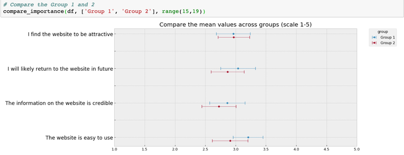
Output:
After all, it helps to have flexible tools at hand for cases where manual work is tedious or simply would take too much time. We have seen that working with survey data using Python is quite simple and powerful. That’s why it powers a big part of trivago’s data processing pipelines. If you’re interested in automating processes with code, you might want to have a look at our Python job offers here.
After all, it helps to have flexible tools at hand for cases where manual work is tedious or simply would take too much time. We have seen that working with survey data is quite simple and powerful using Python. That’s why it powers a big part of trivago’s data processing pipelines. If you’re interested in automating processes with code, you might want to have a look at our Python job offers here.

Follow us on