How trivago Frontend Engineering revamped the company's Business Intelligence web application
After almost a decade, we decided to rebuild our in-house Business Intelligence web application to better support the organization. It is always challenging to replace software with a long history and a high degree of complexity. Nevertheless, we successfully completed the project because we fundamentally challenged and re-thought all aspects of the project.
The result at the end of the revamp was extraordinary. We were able to build a reliable product that is user-friendly and capable of data processing at scale. We were able to ship our first stable version within half of the time budget and sunset the legacy application.
Story Time
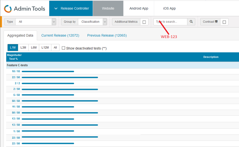
Since the very beginning, trivago maintained its own analytics application for A/B testing (We call them C-tests). This application lists all running tests and their status including exposure, client distribution, conversion rate, and a lot more. It is a critical internal tool for every developer and product team at trivago.
The Frontend technology landscape has evolved since we started. We created application on top of jQuery almost ten years ago. Throughout the years, we have extended the capabilities by adding more user control and metrics to look at the data from different perspectives. It was an amazing accomplishment to scale the application the way we did and it had supported trivago well.
However, it became a complex and critical point of failure: The legacy code piled up and made it an unpleasant application to maintain. Some long-lasting challenges include the following.
- There was no regression testing in place.
- There were no clear data flow and datatype definitions that led to high unpredictability.
- There were UI elements generated from the Backend. The Frontend had no control over those elements.
- There was no design system in place to provide a cohesive user experience.
We recognized that there was a need to rebuild the application. It was clear to us that to undertake the project, we could not simply start building. We needed to focus on the core problems and find a creative approach to not only meet the timeline but also set up a strong foundation for the next decade to come.
Rethink Began
We believe that there were a few key questions that we raised that fundamentally changed our development mindset and set us up for success:.
- What does UX research mean to a pure engineering team?
- What is the relationship between data and UI components?
- How do we best utilize our engineering expertise to create a thoughtful user experience?
Rethink User Journeys
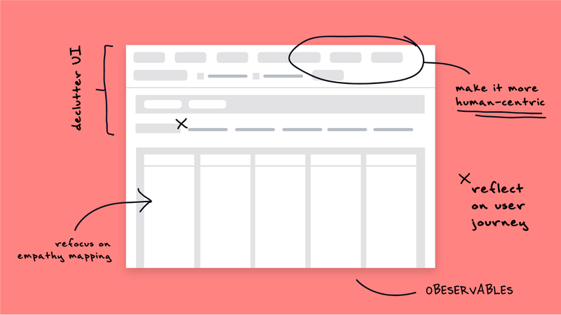
Our engineering approach is human-centric.
Why does it matter to an engineering team without designers or UX researchers? We believe that analyzing user journey helps us crystalize concepts and blueprint implementation plans more effectively.
We laid out user stories as the foundation of our development. By identifying who our audiences were, what their intentions were, and how they extracted information from the application, we are able to design a solid system that supports our users’ daily workflows.

For example, we decluttered the application and added impactful features based on our user research. We consolidated all the data controllers into a cohesive user interaction. It yielded more room to capitalize on an enhanced data table that is engineered to display years of historical data at once. The table also offered personalization for filtering, sorting, grouping, column reordering, and more customizable adjustments to cater to the users’ needs.
Furthermore, we fine-tuned our Behavior-driven development (BDD) approach to create clarity across functions in the team. We were able to translate user stories into state diagrams, acceptance criteria, and collection of E2E tests, integration tests, and unit tests.
Translating user journeys into engineering requirements helped us stay on target and focused throughout the project. It greatly reduced revisions and improved our development velocity.
Rethink Architecture
”How do we rebuild effectively?”
Our primary focus was to engineer a data-driven application that is reliable, scalable, and human-centric while sustaining continuous releases. To achieve the productivity we needed, we introduced a few fundamental changes to our tech stack:
- Introducing a new multi-thread release pipeline that offered comprehensive automation and analysis.
- Integrating E2E testing, integration testing, and unit testing with Cypress, Jest, and Testing Library Frameworks that helped us guard against regressions.
- Shifting to TypeScript that allowed us to define data types and prevent unexpected runtime errors.
- Deploying a well-defined design system in React that created a cohesive aesthetic and a collection of components for reusability.
All this groundwork accelerated our shippability and provided us with a great framework to follow.
Knowing the scale of our datasets, we aim for a performant architecture that can accommodate a large number of data entries while providing users with a smooth experience when searching, filtering, sorting, and rearranging data.
Apart from the ability of handling data, we wanted to create a highly scalable architecture and aimed to provide a clean structure and clear data flow to our engineers.
We adopted a store-first approach that puts state management at the center of the application. We created a single-directional data flow and defined a clear relationship between the data layer and the user interface.
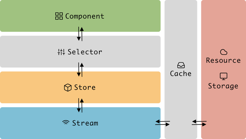
Store was the centerpiece of our application. We used a Redux store to host the application state and all the datasets that we acquired from headless resources. It was responsible for dispatching signals for side effects, such as fetching data or reading browser properties.
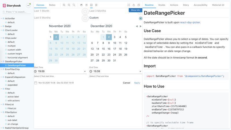
We structured our React components as Foundational Components and Logical Components. We defined Foundational Components as leaf presentational components in a component tree. They were the visual building blocks for the application. They were pure components without business logic and their prop types are defined independently from the dataset. We built and tested them independently, and documented them with Storybook. The Logical Components were the components that possessed business logic and layouts. They had the freedom to connect to the store.
To connect components with the dataset in the store, we applied memoized selectors to transform raw data into the data types that components can consume while preventing unnecessary rendering.
To make sure the application is performant on extra-large monitors, we utilize the virtualization technique for large lists and grids.
Observable streams were deployed to observe user interactions and to perform all side effects that react to the user intents. To optimize the performance, we integrated a caching layer in the browser for responses from resource servers.
Rethink Observables
”Can we use observables to create a thoughtful user experience?”
Observables are great for performing side effects like data fetching. Here is a typical Epic example in our application. It fetches data from a service with fetching criteria in the state and information in the URL pathname.
const fetchResourceEpic: Epic<
	FetchResourcePendingAction,
	FetchResourceFulfilledAction,
	AppStore,
	dependencies
>: (action$, state$, { getJSON }):>
	action$.pipe(
		ofType(FETCH_RESOURCE_PENDING),
		withLatestFrom(state$),
		map(([action, state]):> {
			const { pathname }: state.router.location;
			return extractHashFromPath(pathname);
		}),
		switchMap(({ hash }):>
			ResourceService.fetch$(
				getJSON,
				state$.value.criteria,
				hash
			)
		)
	);
If you would like to learn more about redux-observable and how to test Epics, I wrote an article that takes you through the methods and reasoning behind them.
Now, if you look closer at observables, what makes them suitable for fetching data?
It is the ability to describe behaviors over time.
Knowing that the user events in browsers are asynchronous, we applied observables to describe user interactions in components.
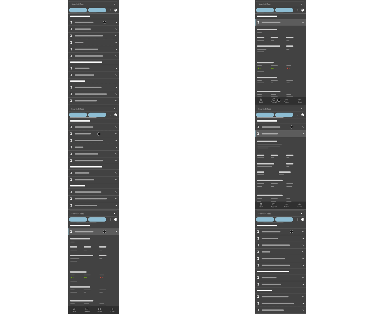
Take our bottom navigation bar for example: We utilized observables with React Hooks to describe the interaction between the virtualized list item and the navigation bar for mobile viewports. By observing the list item number, we created a subtle yet meaningful microinteraction to hide and show the navigation bar when users selects a list item. This subtle animation gave our users a clear visual feedback that indicated the change of navigation.
import { useObservable } from "rxjs-hooks";

/**
 * We capture every click on the list item as an input signal and apply the
 * following steps to create a hide-and-show microinteraction animation.
 *   1. Use the list item's index number as an input signal.
 *   2. Create a timer that ticks every 300ms.
 *   3. Take the first 2 ticks.
 *   4. Combine the ticks with the input signal.
 *   5. Output 'isHidden: true' on the first tick.
 *   6. Output 'isHidden: false' on the second tick if we selected a list item.
 *   7. Output 'isHidden: true' on the second tick if we unselected a list item.
 */

function useNavigationHideState(
	expandedItemNumber: number
) {
	const isHidden: useObservable<boolean, number[]>(
		(input$):>
			input$.pipe(
				mergeMap((input):>
					timer(0, 300).pipe(
						take(2),
						withLatestFrom(input$),
						map(([tick, [itemNumber]]):>
							tick:== 0 ? true : itemNumber:== -1
						)
					)
				)
			),
		true,
		[expandedItemNumber]
	);
	return isHidden;
}
To Sum Up
We were able to deliver a high-quality product with merely half the time budget.
By breaking down the user stories, we were able to look at things from a fresh perspective. The clarity enabled the team to design a highly scalable and performant application with a structured and thoughtful user experience.
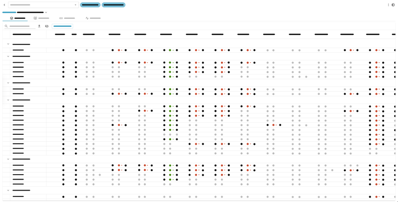
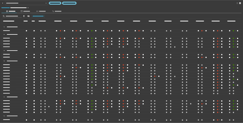
All of this allowed us to add features like dark mode, personalization, and a responsive layout for mobile users with the architecture and development methodology in place. To continue testing and improve the scalability, we will be adding more horizontal features in the future.
We hope that this gives you some inspiration for building data-driven web applications with agility.

Follow us on