The still experimental feature of CSS container queries allows us to make child elements listen on the current layout state of their parent element via pure CSS declarations.
In depth view into container queries.
Have you ever wondered about how to create components that not only change their appearance according to the viewport’s width but instead also transform according to their parent element’s sizing? This might be the case when you have a card component that has the classical vertical layout on mobile:
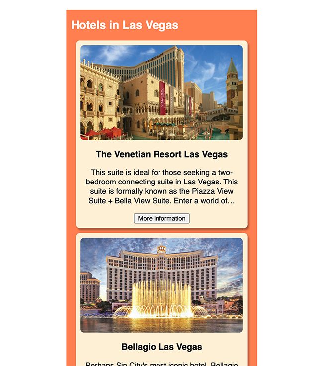
But on wider viewports, it has a layout that shows the image floating right next to the card’s text – a more horizontally optimized layout:

We could already achieve these layout challenges in the past by using common media queries. But it left us with the situation that if we’d put the same card component into a narrow context column while being on the bigger viewport we would still see the regular layout version as we specified it in our CSS media queries:
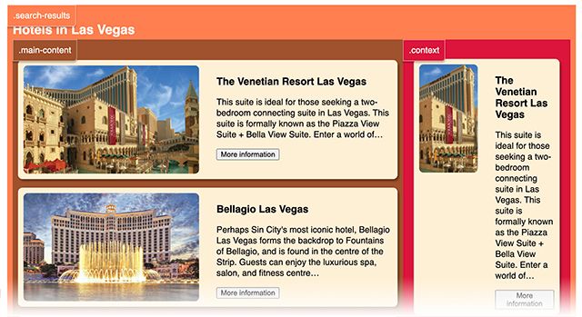
CSS container queries allow us via simple declarations to make our components respond to their parent element’s current layout state. By querying the parent’s render properties, we can enter a new realm, where we can just declare that our card component should render differently if the parent element grants it enough room to do so.
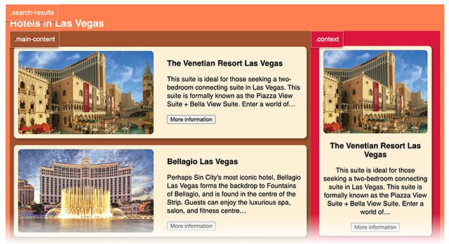
Thereby layout changes can be altered depending on our component’s attributes instead of cumbersome toggling of additional CSS styles via JavaScript. This keeps the layout concern separated from the logic concern and additionally comes with increased render performance.
How to approach CSS container queries?
As of now (January 2022), CSS container queries are still an experimental feature meaning that we are currently rather speaking about a proposal than an official specification from the W3C. But an early stage specification already exists. Don’t forget it is still in proposal state which means you could still encounter some bugs when trying it out by yourself.
According to the current state of the MDN Web Docs the container queries proposal is to become part of CSS containment.
The container queries specification is to become part of
css containment. The initial CSS Containment draft defined thecontainproperty to allow for performance optimizations. It provides a way for web developers to isolate parts of the DOM and declare to the browser these are independent from the rest of the document. Source: MDN Web Docs
The CSS Containment specification deals first and foremost with render performance optimizations. It allows us to isolate parts of the DOM and declare to the browser that these are independent from the rest of the document. This can mean, for example, that the browser might not render certain articles in a set of many, that are outside the viewable area. Or treat such an article’s children in a way where their style properties wouldn’t affect the parent itself anymore. An example would be that the parent’s box model size wouldn’t be extended by inner children elements. More details about all the different values that currently exist for the contain property can be found inside the current state of the early stage specification.
Browser support
Google Chrome is the first web browser already supporting this experimental feature. To test it, we need to activate the feature in our Chrome browser (version 92+) via chrome://flags. Inside the “Experiments” section just activate “Enable CSS Container Queries”.
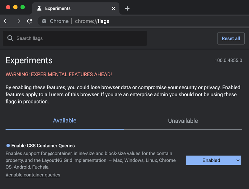
The webkit based browsers Opera (version 79+) and Edge (version 93+) also support the activation of this flag. We can monitor the current state of support on caniuse.com.
For other browsers the Google Chrome Labs team has released a polyfill on github.
How to set up CSS container queries?
Setting up container queries is surprisingly easy and straightforward.
At first, we have to declare the container-type property inside the parent element’s body. In this example our children elements with the class .card will query the width of our parent element called .main-content.
.main-content {
  container-type: inline-size;
}
Possible values for container-type are:
sizewhich would signal to the browser that the size of this element is known in width and height.inline-sizewill indicate to the browser that our container will query on the inline axis (available width).block-sizewill indicate to the browser that our container will query on the block axis (available height).stylecreates a query container for style related queries (querying for things like enabled dark modes, color compositions, accessibility support and further more).statecreates a query container for state related queries (animations).
With the container-type declaration on our parent element we are indicating to the browser that certain child elements are listening to this container’s changes either in dimension (size, inline-size, block-size), its visual appearance (style) or its current state within an animation for example (state).
As a second step, we set up our container query by using the @container keyword which will be followed by a condition that reminds us very much of regular @media queries. Inside the body of the @container query, we declare all the style changes on inner components.
@container (min-width: 720px) {
  .card {
    display: flex;
    margin-bottom: 16px;
  }

  .card .image-wrapper {
    max-width: 400px;
    width: 50%;
  }

  .card .text-wrapper {
    margin-left: 32px;
    text-align: left;
    width: 50%;
  }
}
We are even free to listen only to specific parent containers by naming them via container-name.
.article-gallery {
  container-type: inline-size;
  container-name: article-gallery;
}

@container article-gallery (min-width: 720px) {
  .wrapper {
    display: flex;
    flex-wrap: wrap;
  }

  .card {
    display: block;
    width: calc(25% - 20px);
  }

  .image-wrapper {
    width: 100%;
  }
}
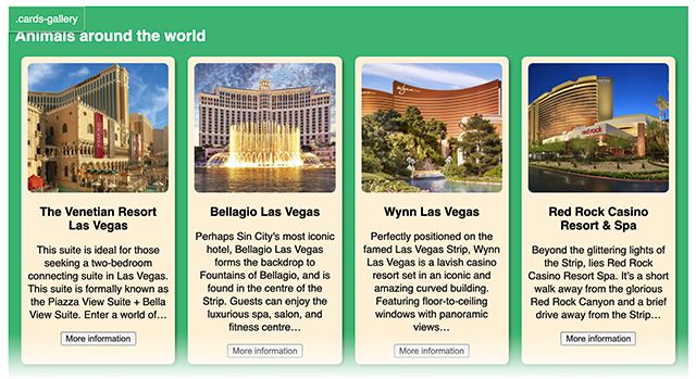
This would give us more layout flexibility because now, by just referencing names instead of any parent element’s width, we can overwrite the container query from our former example inside of .search-results .main-content, which renders the .cards component in its wide layout. Because in this case, we would like to have the narrow layout of .cards floating next to each other even though the parent container .article-gallery stretches further in width than our former 720px.
What will the future bring?
We can expect better support in the future for container-type: style; and container-type: state; which at the point of writing this article don’t seem to fully work yet. These two declarations make me dream of a CSS world where I could query for the parent element’s background color and declare bright font inside dark components. Things like dark modes and other accessible design patterns would be way easier to realize. Also querying for the usage of variables is currently discussed.
@container (var(--color-mode) = dark) {
  a {
    color: white;
  }
}
container-type: state; hopefully will support us in the future to listen to certain points on an animation or transition timeframe.
Browser support
Having a look on caniuse.com shows us that Chrome, Edge and Opera should already partially this feature by enabling it as experimental feature. Hopefully, Firefox, Safari and individual mobile browsers will follow soon.
It might be interesting to note that new suggestions for the syntax of container queries are still in discussion:
@container (width <= 150px) {
    (...)
}
If you want to see the examples from the demo screens in action, please check out this codepen of mine.

Follow us on